
Comparing the quantiles of two groups provides information that is lost by simply looking at means or medians. This post shows how to do that.
Traditionally, the comparison of two groups focuses on comparing means or medians. But, as Wilcox (2012) explains, there are many more features of the distributions of two groups that we may compare in order to shed light on how the groups differ. An interesting approach is to estimate the difference between the quantiles of the two groups. Wilcox (2012, pp. 138-150) shows us an approach that is based on the shift function. The procedure boils down to estimating the quantiles of both groups, and plotting the quantiles of the first group against the difference between the quantiles.
In order to aid in comparing the quantiles of the groups, I’ve created a function for R that can be used for plotting the comparison between the two groups. The functions uses the ggplot2 package and the WRS package (that can be found here: WRS: A package of R.R. Wilcox’ robust statistics functions version 0.24 from R-Forge (rdrr.io)) ; see also: Installation of WRS package (Wilcox’ Robust Statistics) | R-bloggers (r-bloggers.com).).
library(WRS)
library(ggplot2)

plotSband <- function(x, y, x.name = "Control") {
  x <- sort(x[!is.na(x)])
  y <- sort(y[!is.na(y)])
  qhat <- 1:length(x)/length(x)
  idx.y <- floor(qhat*length(y) + .5)
  idx.y[idx.y <= 0] <- 1
  idx.y[idx.y > length(y)] <- length(y)

  delta <- y[idx.y] - x

  cis <- WRS::sband(x, y, plotit=F)$m[, c(2, 3)]

  check.missing <- apply(cis, 2, function(x) sum(is.na(x)))
  if (sum(check.missing == length(x)) > 1) {
    stop("All CI limits equal to - or + Infinity")
  }
  ylims <- c(min(cis[!is.na(cis[,1]), 1]) - .50,
             max(cis[!is.na(cis[,2]), 2]) + .50)

  cis[is.na(cis[, 1]), 1] <- ylims[1]*5
  cis[is.na(cis[, 2]), 2] <- ylims[2]*5

  thePlot <- ggplot(mapping = aes(x)) +
    xlab(x.name) +
    geom_smooth(aes(x = x, y = delta), se = F, col="blue") +
    ylab("Delta") +
    geom_point(aes(x = quantile(x, c(.25, .50, .75)),
                   y = rep(ylims[1], 3)), pch=c(3, 2, 3), size=2) +
    geom_ribbon(aes(ymin = cis[,1], ymax = cis[,2]), alpha=.20) +
    coord_cartesian(ylim = ylims)
  suppressMessages(print(thePlot))
}
Let’s look at an example. Figure 1 presents data from an experiment investigating the persuasive effect of narratives on intentions of adopting a healthy lifestyle (see for details Boeijinga, Hoeken, and Sanders (2017)). The plotted data are the differences in intention between the quantiles of a group of participants who read a narrative focusing on risk-perception (detailing the risks of unhealthy behavior) and a group of participants who read a narrative focusing on action-planning (here called the control group), focusing on how the healthy behavior may actually be implemented by the participant.
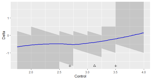
Figure 1 shows the following. The triangle is the median of the data in the control group, and the plusses the .25th and .75th quantiles. The shaded regions define the simultaneous 95% confidence intervals for the differences between the quantiles of the two groups. Here, these regions appear quite ragged, because of the discrete nature of the data. For values below 2.5 and above 3.5, the limits (respectively the lower and upper limits of the 95% CI’S) equal infinity, so these values extend beyond the limits of the y-axis. (The sband function returns NA for these limits). The smoothed-regression line should help interpret the general trend.
How can we interpret Figure 1? First of all, if you think that it is important to look at statistical significance, note that none of the 95% intervals exclude zero, so none of the differences reach the traditional significance at the .05 level. As we can see, none of them exclude differences as large as -0.50 as well, so we should not be tempted to conclude that because zero is in the interval that we should adopt zero as the point-estimate. For instance, if we look at x = 2.5, we see that the 95% CI equlas [-1.5, 0.0], the value zero is included interval, but so is the value -1.5. It would be unlogical to conclude that zero is our best estimate if so many values are included in the interval.
The loess-regression line suggests that the differences in quantiles between the two groups of the narrative is relatively steady for the lower quantiles of the distribution (up to the x = 3.0, or so; or at least below the median), but for quantiles larger than the median the effect gets smaller and smaller until the regression line crosses zero at the value x = 3.75. This value is approximately the .88 quantile of the distribution of the scores in the control condition (this is not shown in the graph).
The values on the y-axis are the differences between the quantiles. A negative delta means that the quantile of the control condition has a larger value than the corresponding quantile in the experimental condition. The results therefore suggest that participants in the control condition with a relatively low intention score, would have scored even lower in the other condition. To give some perspective: expressed in the number of standard deviations of the intention scores in the control group a delta of -0.50 corresponds to a 0.8 SD difference.
Note however, that due to the limited number of observations in the experiment, the uncertainty about the direction of the effect is very large, especially in the tails of the distribution (roughly below the .25 and above the .75 quantile). So, even though the data suggest that Action Planning leads to more positive intentions, especially for the lower quantiles, but still considerably for the .75 quantile, a (much) larger dataset is needed to obtain more convincing evidence for this pattern.